Following are my personal comments on specific markets and issues. I chart markets for a hobby and my comments are the result. They are not recommendations to buy or sell anything and should not be thought of as such. They are for entertainment purposes only so enjoy.
Please remember, the following is pure speculation based only on my experience and chart patterns. "Every sunken ship has a room full of charts."
David Bruce Edwards
May 23, 2026
Note - I got a new, wider screen monitor and when I look at this web site with the screen size in full, the site spacing does not come out properly. By making the window less wide all of the text and graphics slide into place. Perhaps you are having the same experience. DBE.
As usual, I will show pictures and graphs found on Zerohedge.com, Sentimentrader.com, which include the Seasonality charts and charts made on Barchart.com. I will also mention "cycle low timing bands" suggested by another market website to which I subscribe, Cyclesman.com.
Two weekends ago, when I wrote my last update, there was widespread belief that we were close to a deal with Iran. When it didn't happen, markets sold off but recovered going into this weekend based on that same hope. I write my update on Friday night and Saturday then do a final edit on Sunday. On Saturday evening, the White House released a statement saying that we are close to a negotiated end to the war. Early Sunday morning there were more stories confirming that some kind of agreement is in the works that will reopen the Strait for Iran and all other shippers. We had false starts in the past but this one looks like it could be the real thing. My update is based on what I know as I write. Depending on what happens over the next two days, most of it will be outdated. Let's hope this war is over and our sailors and soldiers can come home.
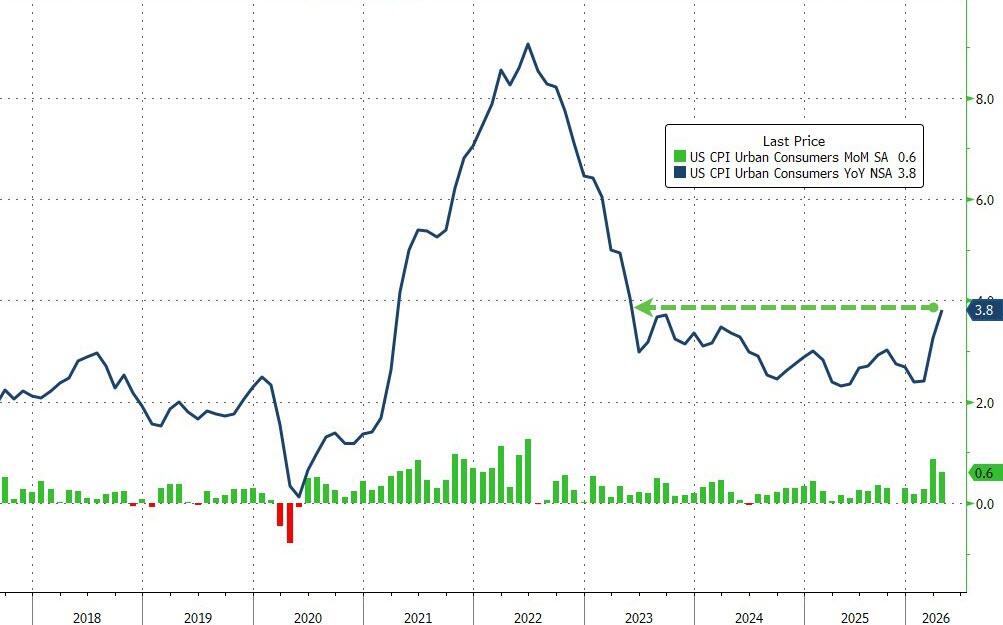
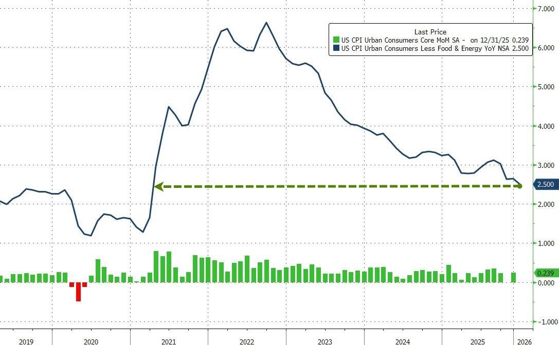
On the 12th we got the Consumer Price Index (left). Analysts expected it to rise and it did. The headline number was up 0.6% for the month with a year over year reading of 3.8%. The Core Index that subtracts food and energy was up .376% monthly and 2.8% annually. Real wages, which had been keeping pace with inflation, fell below the rate of price increases.
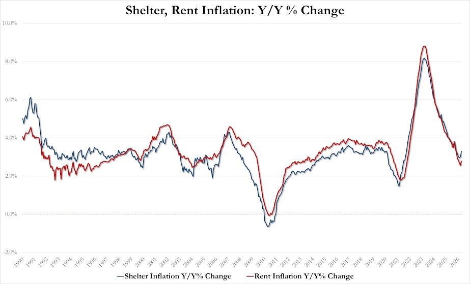
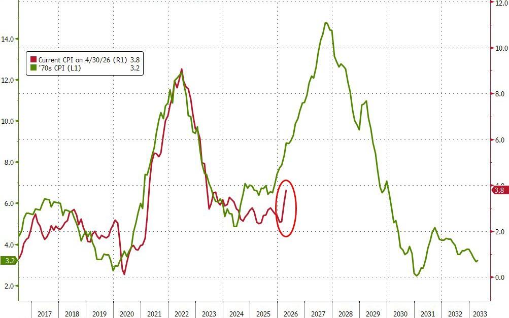
For months, analysts wrote that rents are falling in many markets and home prices are beginning to come down. The Rent and Shelter (left) component in the CPI showed the opposite with the rate of increase on the rise. After the report, the graph on the right, comparing this decade with the 1970s was everywhere.

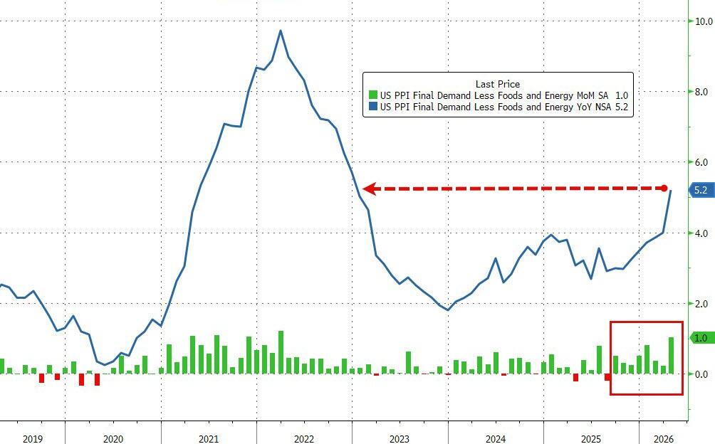
The Producer Price Index (left) was even worse, rising 1.4% for the month and 6% over the last year. The cost of services and energy caused most of the damage. The Core reading (right) was up 1% last month and 5.2% for the year as energy prices indirectly effect everything else. Interest rate spiked (bonds fell) on the news.
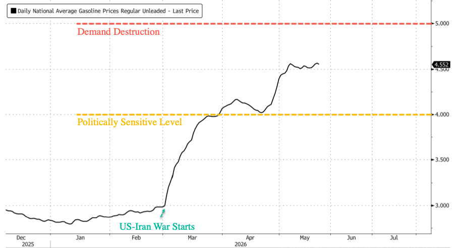
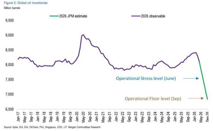
At the heart of the problem is the cost of gasoline and diesel. On the left is a graph showing the daily retail price to fill up your tank. Diesel prices are in the $6 to $7 range. The right side graph shows an estimate of crude oil inventories in the world. Traders hope for a deal over the long weekend but the clock is ticking. The largest crude oil storage area in the U.S. at Cushing, Oklahoma is almost empty.
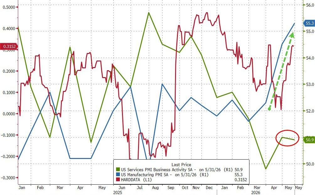
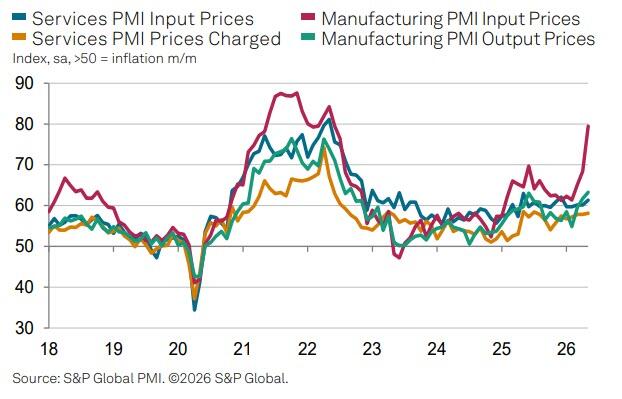
The green and blue lines on the left side graph are the results of purchasing managers' surveys on manufacturing and services. Manufacturing is doing great but services are limping along, barely above the 50 break even point. The red line shows hard data as opposed to surveys. The surprising part of the data is the red line on the right side graph. It shows the trend in prices paid for inputs into manufacturing. Output prices will rise to compensate for the higher costs.
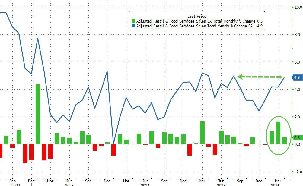
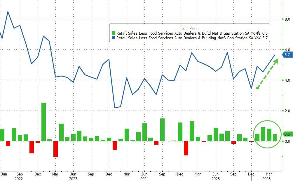
Retail Sales (left) were up a healthy 0.5% monthly and 4.9% for the year. The Core Reading (right) that subtracts Cars, Gas Stations and Building Materials was up even more at 0.5% for the month and 5.7% for the year. I read reports every day about the K shaped economy and how consumers are desperate. It is not showing up in the retail sales numbers.
.
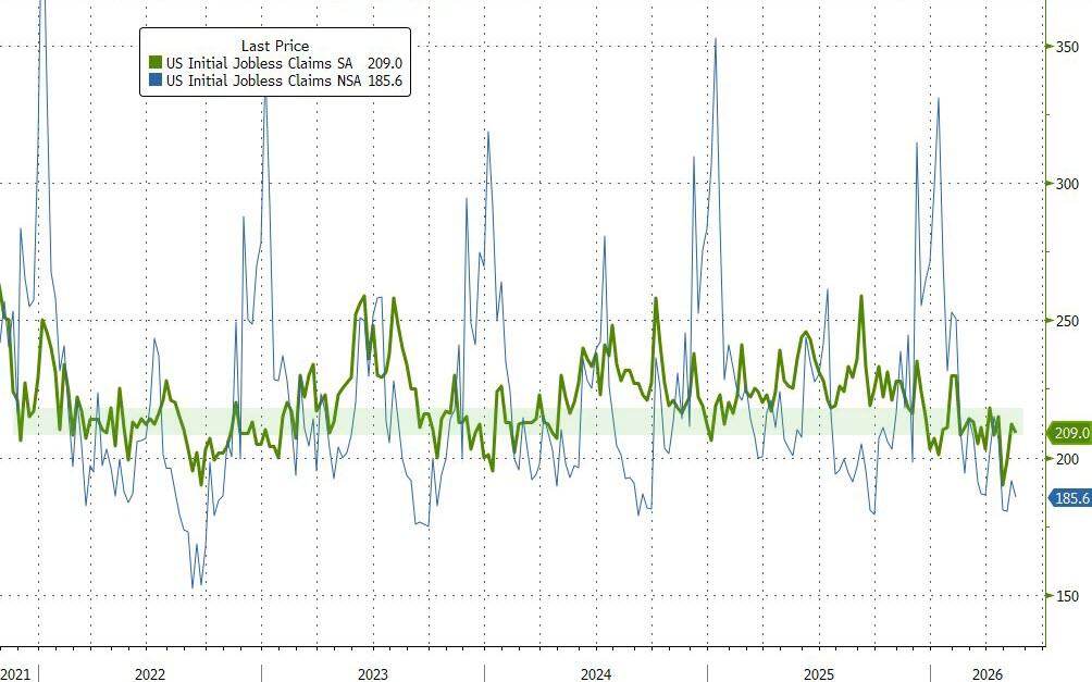
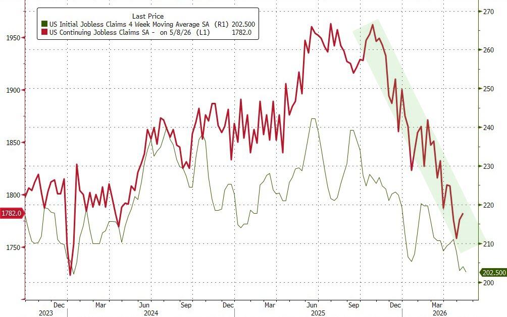
This morning I listened to an interview with a labor economist who talked about the lack of jobs for top tier college graduates. She said that entry level jobs that used to be offered to these young people are now being done by AI. Meta and other high tech companies announced thousands of layoffs in the last two weeks. They include some kind of severance package so they will not show up in the New Claims for Unemployment Benefits statistics for a while. Last week's number was 209,000 and as can be seen by the green line on the upper left side graph, there is no surge in layoffs. Continuing Claims ticked up a bit to 1, 782,000 (right side, red line).
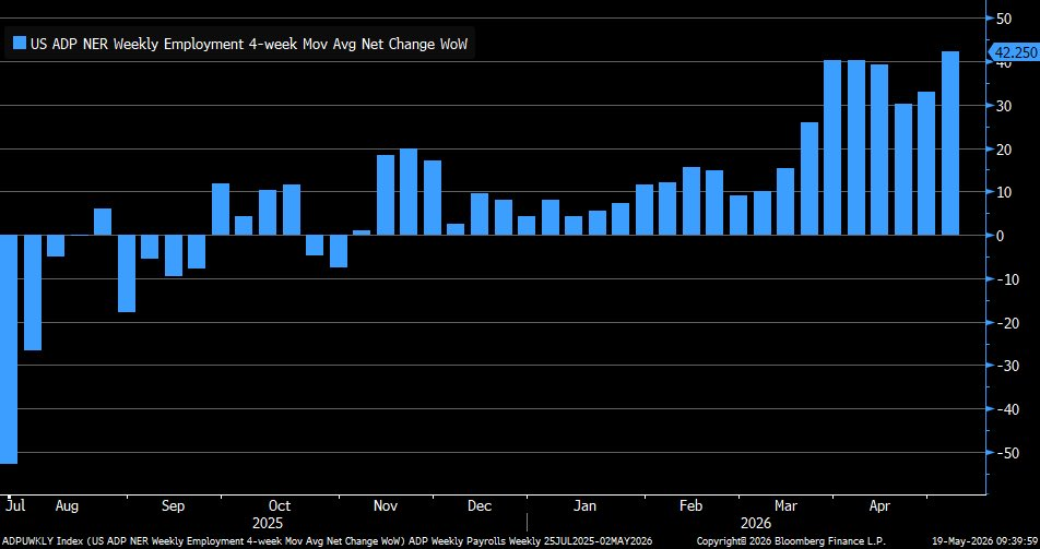
ADP publishes a four week average for job gains or losses and it is running in the 40,000 jobs per month range. Analysts claim that in an economy with a flat to declining working age population, this is a good number.
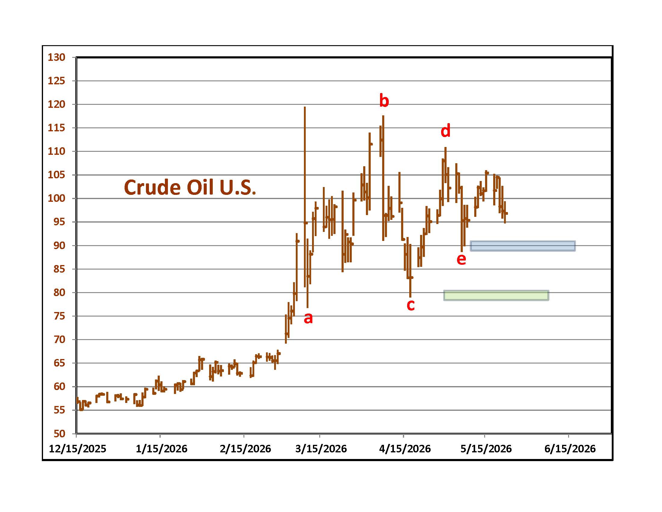
Crude Oil is still trading within the area of a contracting formation that started two and a half months ago. It finished the week within a Dollar of where it was two weeks ago. Will there be an agreement over the long weekend? Even if the Strait is opened, it will take weeks for the tankers that are released to get to their destinations and even more time for empty tankers to reach loading points in the Persian Gulf. Some of the regional oil and refining capacity is damaged and will need to be repaired.
If oil drops below the blue level on the graph at around $90 it will lower the odds that the pattern will lead to a spike higher. A break of the green area around $78 will increase the odds of more downside.
Almost all markets, including stocks, bonds, precious metals, industrial metals and wheat are trading off of oil prices. The least sensitive market is the stock market because traders are sure that the war will wind down, oil will drop to $50 and gas to $2.
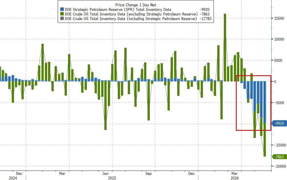
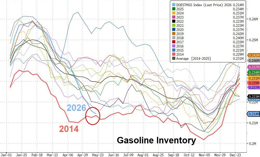

The most recent domestic oil inventory report is for the week of May 15th. Crude Oil Inventories (not including the Strategic Reserve) fell by 7.9 million barrels. Storage levels are 5% below the five year average for this time of the year. The government is releasing a record 9.2 million barrels per day from the Strategic Reserve (upper left). Over the past few weeks it is down 10%. Gasoline inventories are 5% below the five year average for this time of the year. Compared with recent years, we are near the low end of the range for May (right). Crude Oil production in the U.S. is steady at around 13,700,000 barrels per day and refineries are running at just above 90% capacity which is about as good as it gets. The reason for the inventory depletions and higher prices is that we are exporting huge volumes of crude and refined products. Distillate inventories rose by 0.4 million barrels and are 9% below the five year average for this time of the year. Refineries are tweaking their systems to produce the maximum quantity of diesel and jet kerosene.
To the left is a graph of prices for Brent Crude, the world contract outside of the U.S. and West Texas Intermediate, our domestic contract. The spread hit $13 in early May and finished the week at $7. The difference in price is a good indicator of how important U.S. exports are to the rest of the world. Officials in Iran read the same statistics and know that our Strategic Reserve and emergency storage in other countries will hit critical levels in June. When our Reserve runs out, will we restrict exports to keep domestic prices from soaring in an election year? If we do, the rest of the world will not care about what Iran might do with enriched uranium or how it threatens Israel. They will demand an end to the war on terms favorable to Iran to save their economies from failing.
Sunday morning addition - If the peace deal is real, the spread between Brent Prices and West Texas will contract. Exports from the U.S. will decline as countries go back to the Persian Gulf for supplies.
Bulls also believe that once a deal is reached there will be a flood of buying that drives the stock market much higher so they are buying now, at all time highs to cash in when the agreement is reached. Will there be any money left to buy when a deal is finally signed?
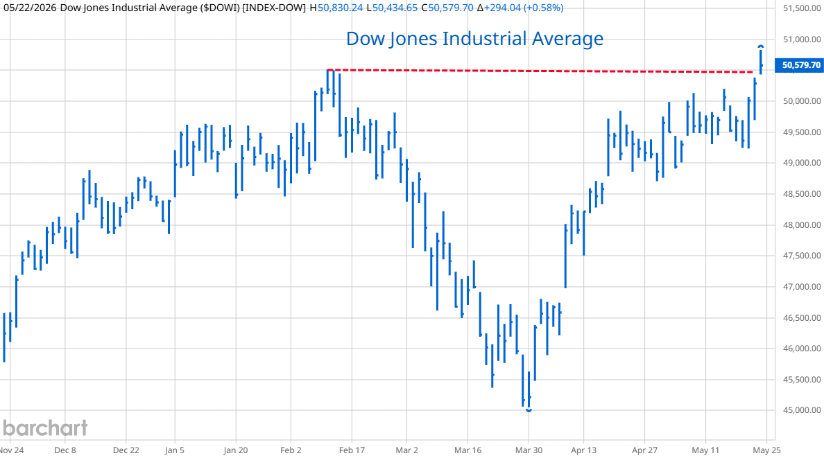
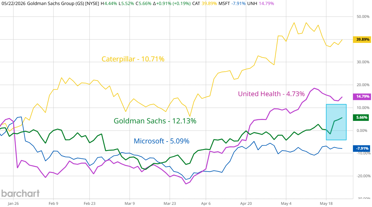
Back at the casino, no one is worried about higher energy costs. The Dow Jones Industrial Average finally hit new highs due to a strong performance by its most heavily weighted component, Goldman Sachs and slight up moves in three of the other four heavyweights in the index.
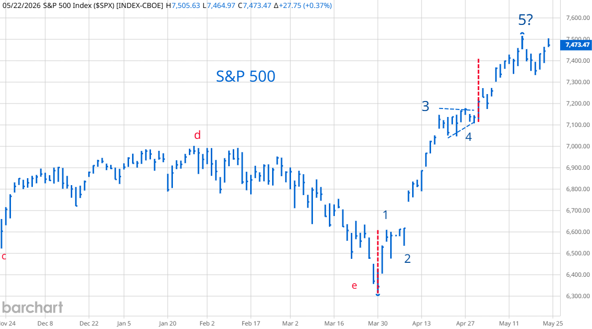
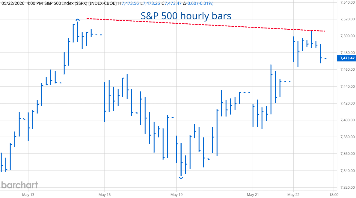
In pure Chart Mysticism terms, the S&P 500 could be finishing the final thrust from an expanding triangle formation. Because of its weighting, it did not make new highs at the end of last week. More and more analysts are referencing the theories of Mike Green. You can find interviews with him on YouTube. He says that the stock market is "broken." This is because around 55% of 401K money goes into S&P 500 Index funds. The job of Vanguard, Fidelity and State Street is to put this money into the stocks in the S&P 500 with the most going to the companies with the largest weighting. These are Nvidia, Apple, Microsoft, Amazon and Google's parent company, Alphabet. The buying is automatic with no judgment about current valuation. Active money managers have to buy the same stocks to keep up with the average.
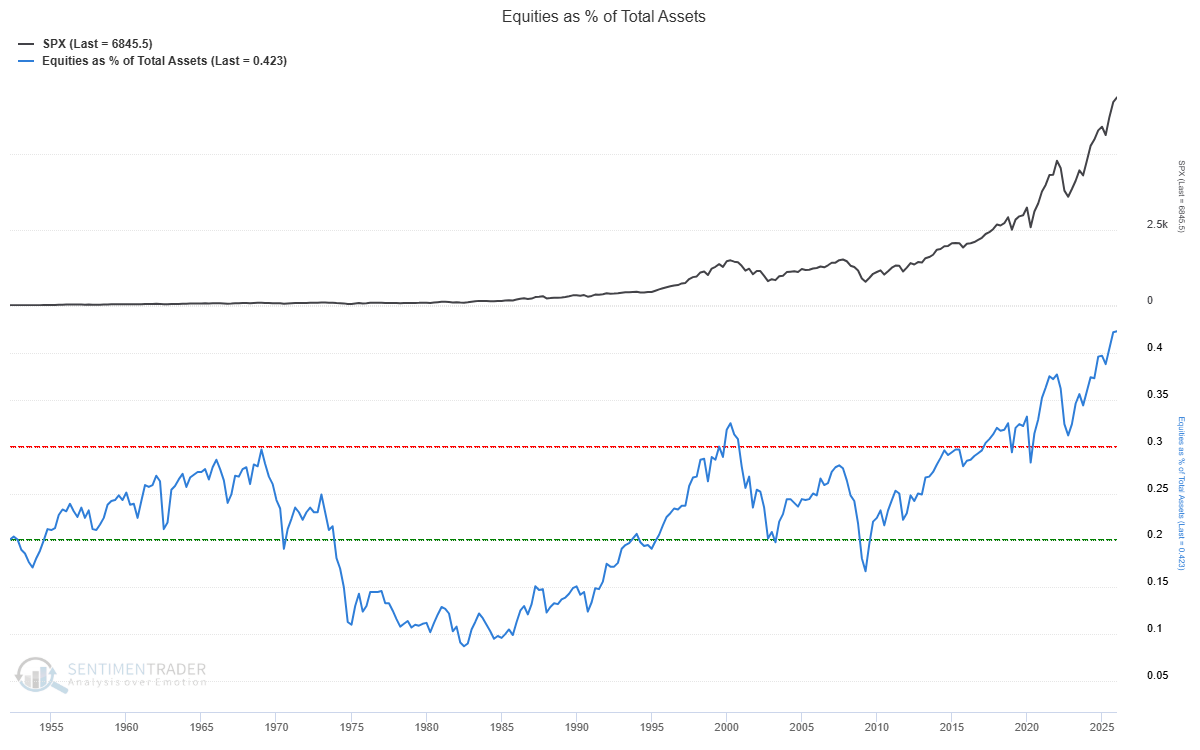
Because people are living much longer, they are worried about running out of money before they die. Younger people are worried that Social Security will run out of money before they retire. Everyone is obsessed with hoarding money and their favored vehicles are S&P 500 index funds. To the right is a graph from Sentimentrader.com showing the percent of wealth allocated to stocks. Green says that this keeps money from circulating in the economy because it is tied up in equities that are automatically purchased at higher and higher prices. Until this "passive bid" for S&P 500 stocks is interrupted, any sell off is likely to be temporary. His current popularity could be a sign that we are near peak "passive bid."
What will interrupt this cycle? Higher unemployment and baby boomers cashing out to pay current expenses. If bond yields keep rising, there could be a point at which the yields on intermediate and longer dated bonds rival probable stock market returns and investors decide to lock in that yield by switching their allocation from stocks to bond funds.
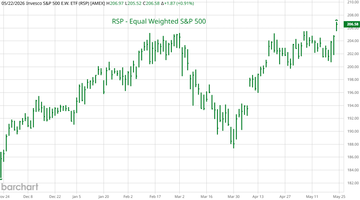
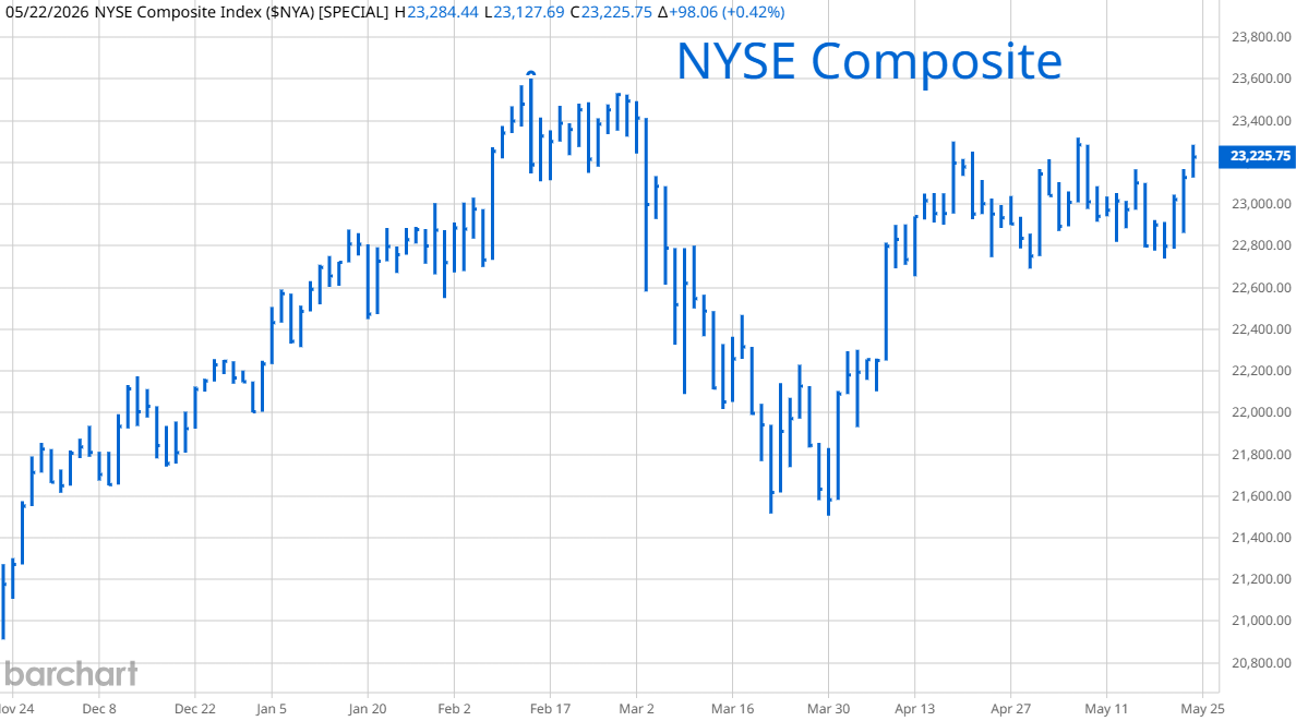
Broader market measurements are not doing as well as the Dow Jones or S&P 500. On the left is a graph of the equal weighted S&P 500. It hit new highs but its gains are muted compared to the capitalization weighted index. On the right is the New York Stock Exchanged Composite and it is still below February's highs. Last week, both the NYSE Composite and NASDAQ Composite had an unusually large number of issues hitting 52 week lows. This kind of dispersion was a warning in past cycles with stocks tending to sell off over the next few months.
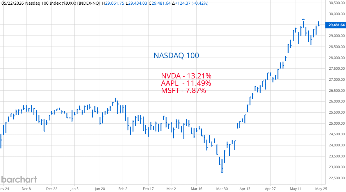
The NASDAQ 100 is dominated by the S&P 500 stocks getting the most money from the "passive bid." It is surprising that it did not hit new highs at the end of the week.

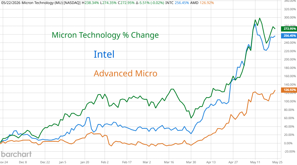
 More and more wealth piled into fewer winners. Two weeks ago, the graph of SMH, the semiconductor ETF and some individual companies looked like stocks going into the 1929 high. I thought they were within days of reversing. We got a violent sell off then a recovery. AMD and SMH made new highs but Micron and Intel fell short by week's end.
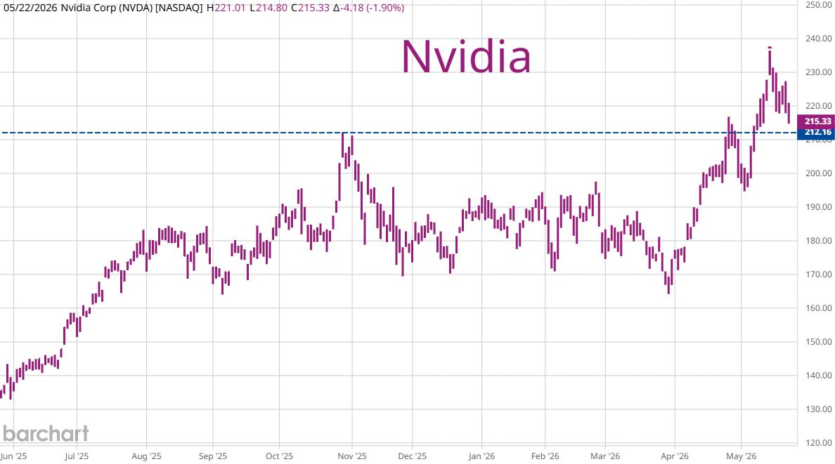
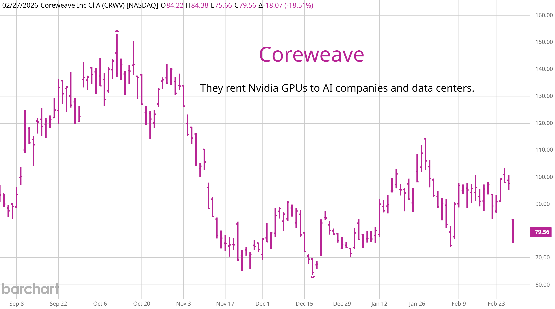
Nvidia posted great earnings but no exceptional upside surprise. By week's end the stock was close to where it was 6 months ago. Skeptics say that even though there are billions of Dollars set aside for data centers, it takes 24 to 36 months to build one and few of them are actually coming on-line. The hyperscales are buying and renting Nvidia chips, Intel's and ADM's processors and memory chips but these are being stored for now because the actual buildings where they will be deployed don't exist. Resistance to data center construction is growing. The sales pitch from hyper scalers is: "We want your water. Your electricity rates will go up and your college graduates won't have jobs." Technology changes very quickly and while these chips sit on the shelf, waiting for data centers to be built, they become obsolete. Nvidia's Blackwell chips were the new thing last year. Now, their latest is Vera Rubin which costs 7.8 million Dollars per stack due to a 435% increase in memory chip costs. Most buyers of Blackwell chips will not deploy them before Vera Rubin takes over. The inventory of unused semiconductors is building.
Coreweave rents out their data center capacity and is a good barometer for computing demand. The SEC is approving a futures contract based on an index of hourly rental costs for access to Nvidia and other types of chips. Investors are overweight the chip sector because they believe that demand is unlimited. A futures contract that gives investors a minute by minute view of actual demand could end the run in these stocks for 2 reasons. 1. Demand might be less than imagined with rental prices flat or falling. 2. Institutional investors might switch from owning shares of semiconductor companies to computing futures because it is a pure play on the expansion of computing power.
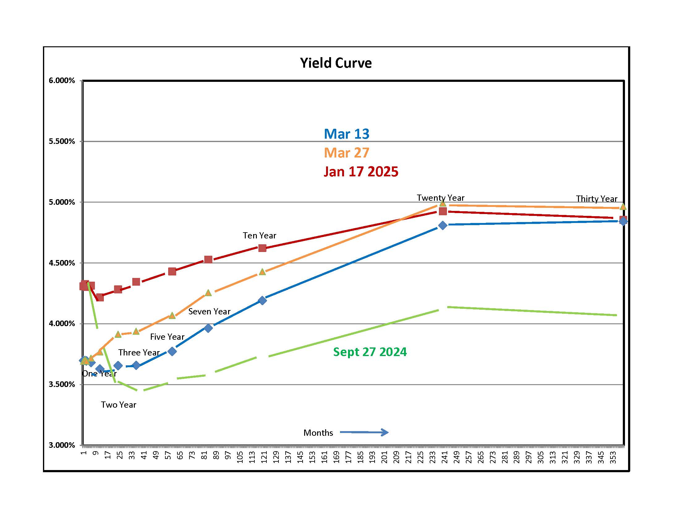
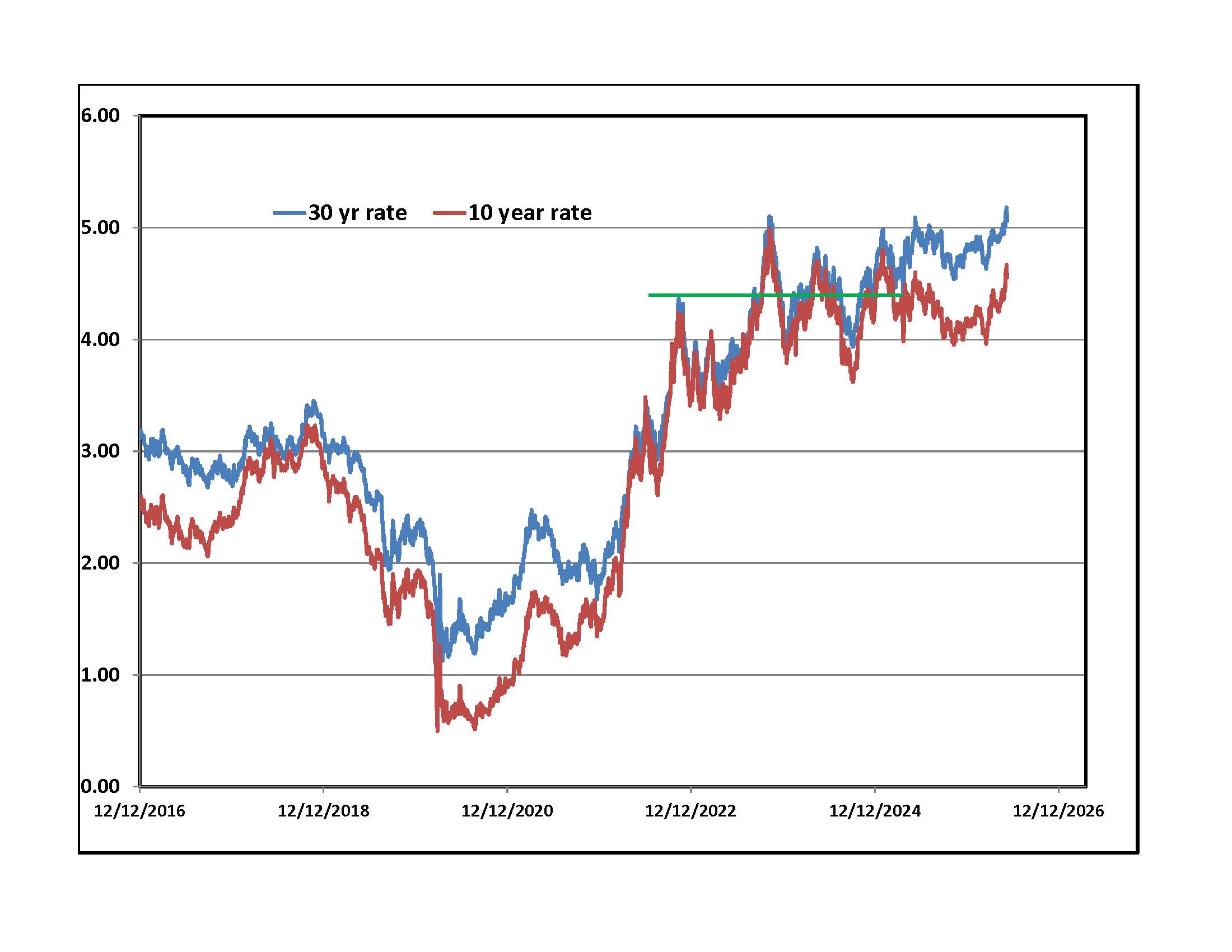
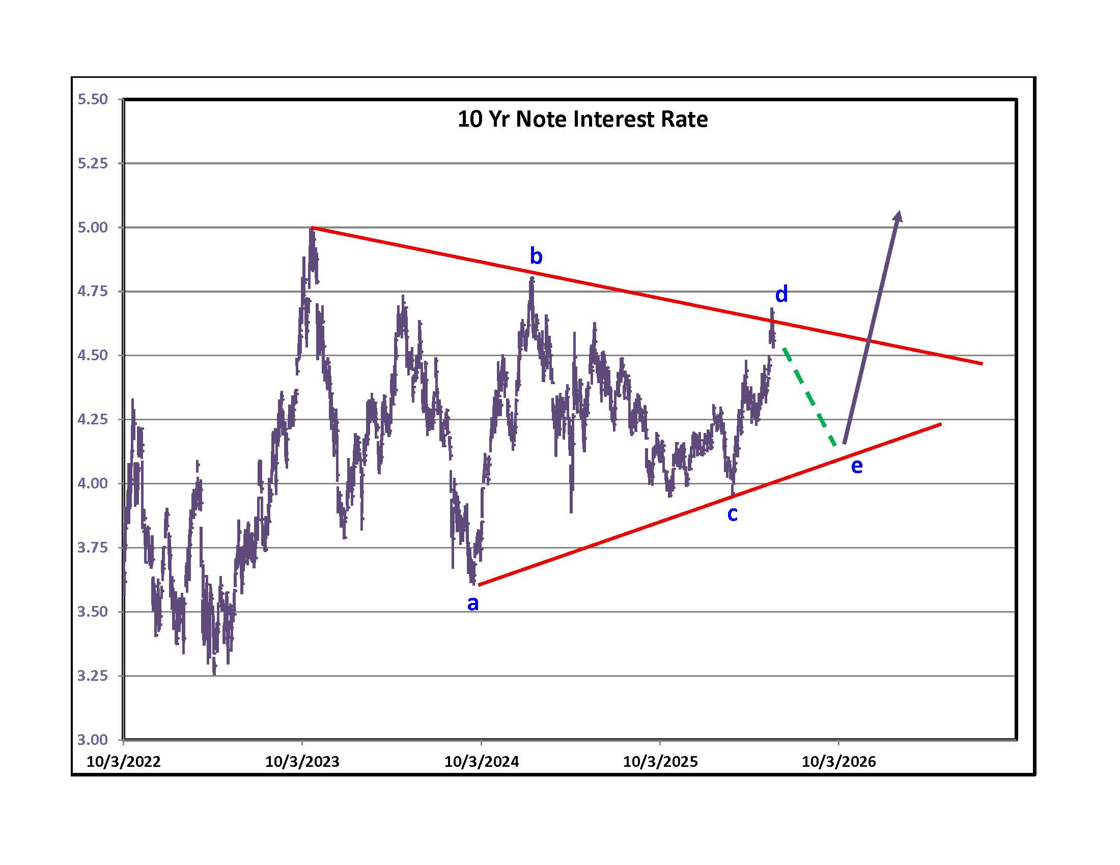
Bond traders are not as optimistic as stock market speculators. Yields rose across the curve as shown by the orange line on the yield curve graph. Longer dated rates hit levels last seen in 2007. Many business owners have not experienced borrowing costs this high. The upper right side graph shows the history of yields on U.S. ten year notes and 30 year bonds. The green line marks the point in 2022 when stocks sold off violently because interest rates rose to levels that analysts assumed would cause a recession. The peak the next year coincided with another stock market low. Traders are highly leveraged. Borrowing rates on margin accounts vary with Robinhood at 5.5% and everyone else higher. Investors are convinced that they can make 20% a year so paying 5% is worth it. Most think that the war will be over soon and rates will plunge so why worry about a passing storm when blue skies are on the horizon? Directly to the right is a graph of rates on the most widely benchmarked debt instrument, the U.S. 10 year note. Chart purists think that rates are tracing out a contracting triangle (like oil but over a much longer time span). If reality follows art then last week could have been a temporary high that will be followed by lower rates into the summer then a sudden burst higher into the fall. Sunday morning addition - Belief in a peace deal could be the reason for yields to back off toward the "e."
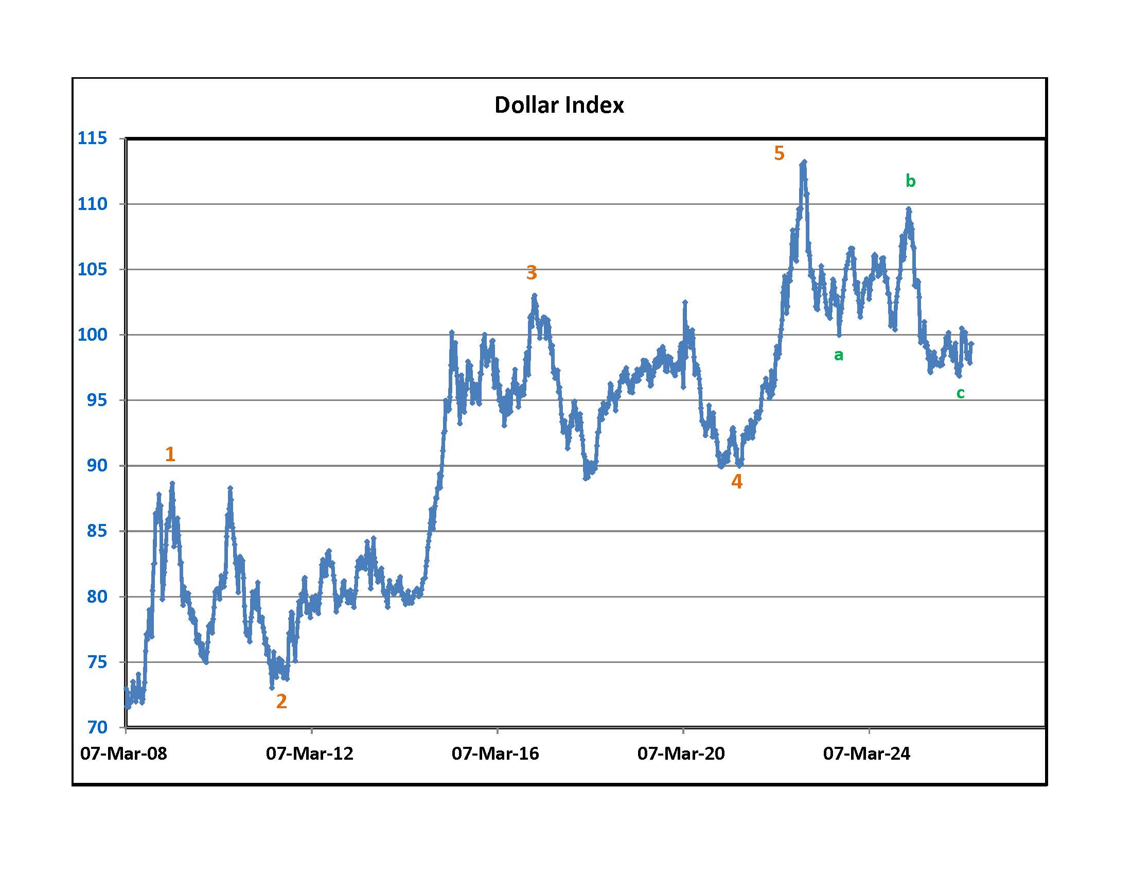
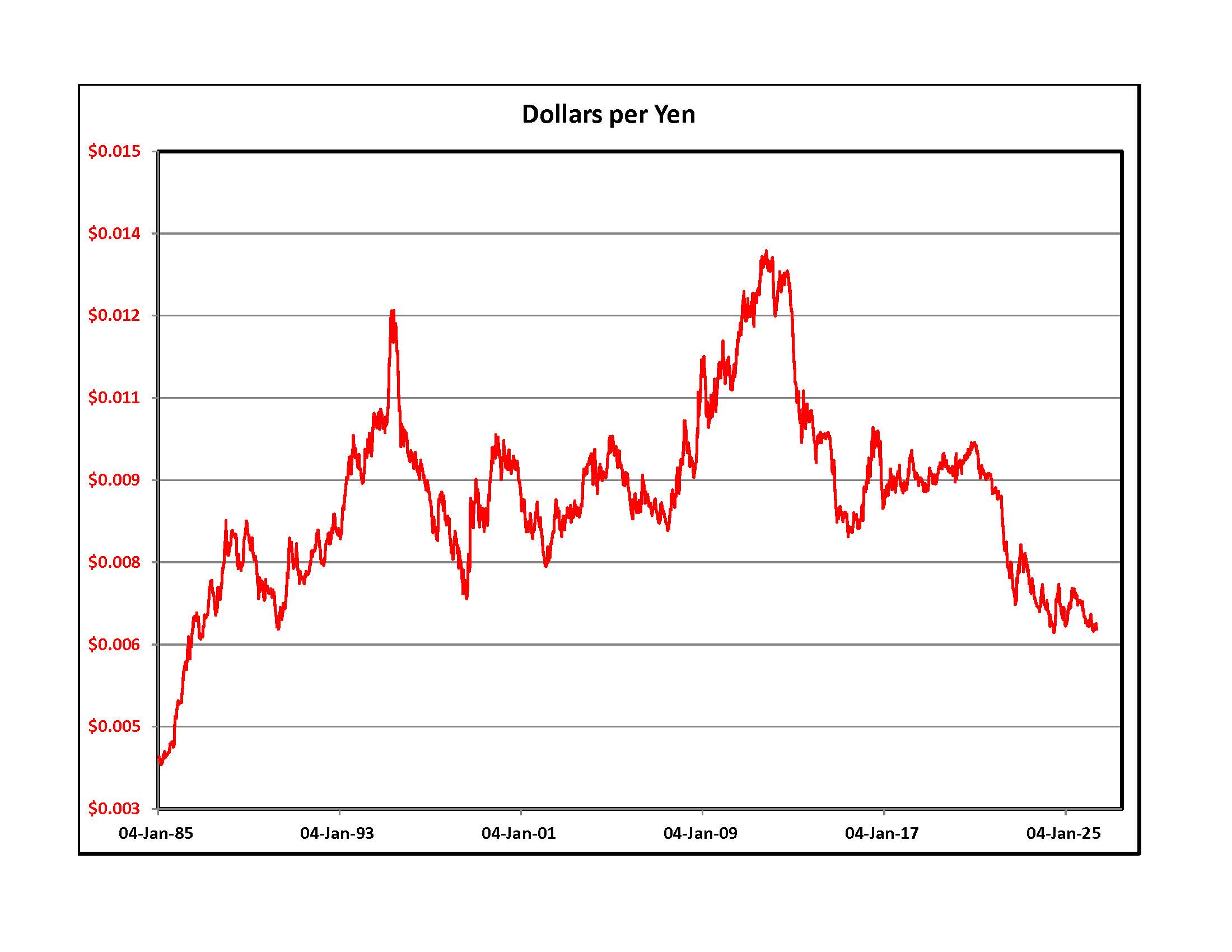
Above is a long term graph of the U.S. Dollar Index and an even longer term chart of the value of one Japanese Yen to a Dollar. The world is carrying a Dollar denominated debt load that will never be repaid unless the Dollar loses a lot of its value against other currencies and economic growth accelerates worldwide. Shortages of diesel, gasoline and natural gas are not going to help. Higher short term interest rates in the U.S. help the Dollar. Japan is helplessly in debt and the new Prime Minister wants to borrow more money to stimulate their domestic economy. When the Yen hit 160 to the Dollar a few weeks ago, the Bank of Japan intervened in the currency markets, spending huge amounts to sell Dollars and buy Yen. The Yen strengthened briefly to around 154. On Friday it closed at 159.16 so all that money was wasted. Sunday morning addition - If the Strait is opened it will be good for both the Euro and Yen at the expense of the Dollar.
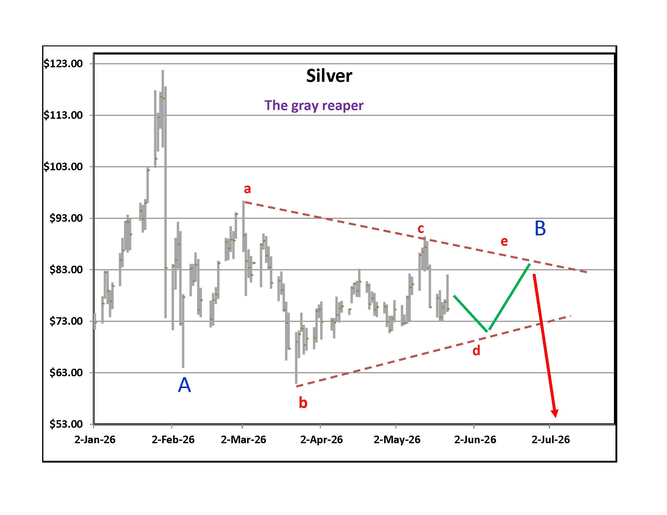
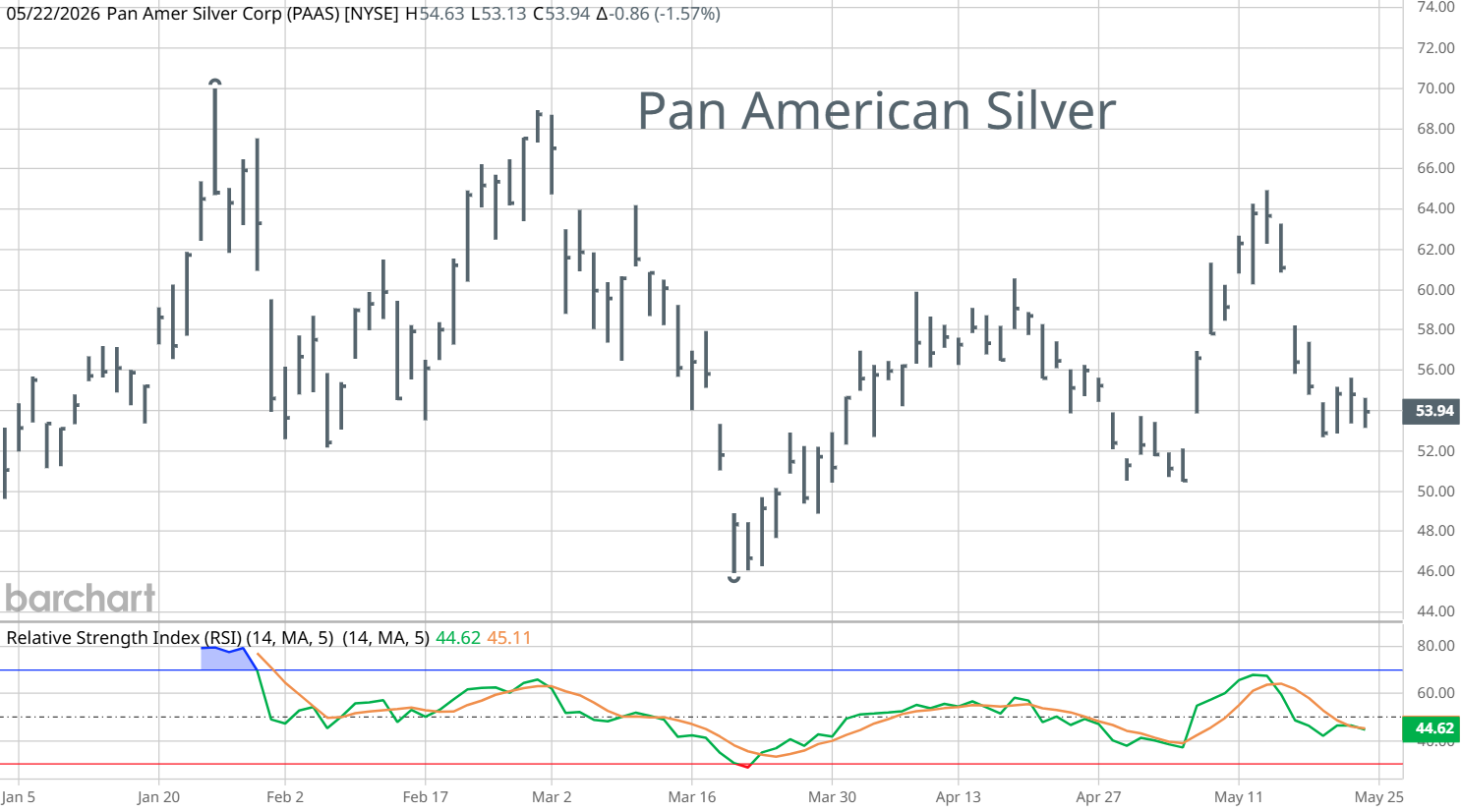
Experience tells me that predicting the outcome of a long sideways consolidation is useless but it is fun to try and do so. A bearish view is that silver is making a larger correction than most expect. We saw an initial "A" down followed by a "B" contracting pattern that will lead to another sell off. On the right is Pan American Silver, a favorite way to play the silver market. Since the peak, the Relative Strength oscillator approached over sold levels just one time. Buying things when others are dumping them in fear increases your odds of making money. It could be worth waiting for that to happen with silver mining shares. July is usually a good month for silver. If we get a June sell off with over sold oscillators it could be a good entry point for a July bounce.
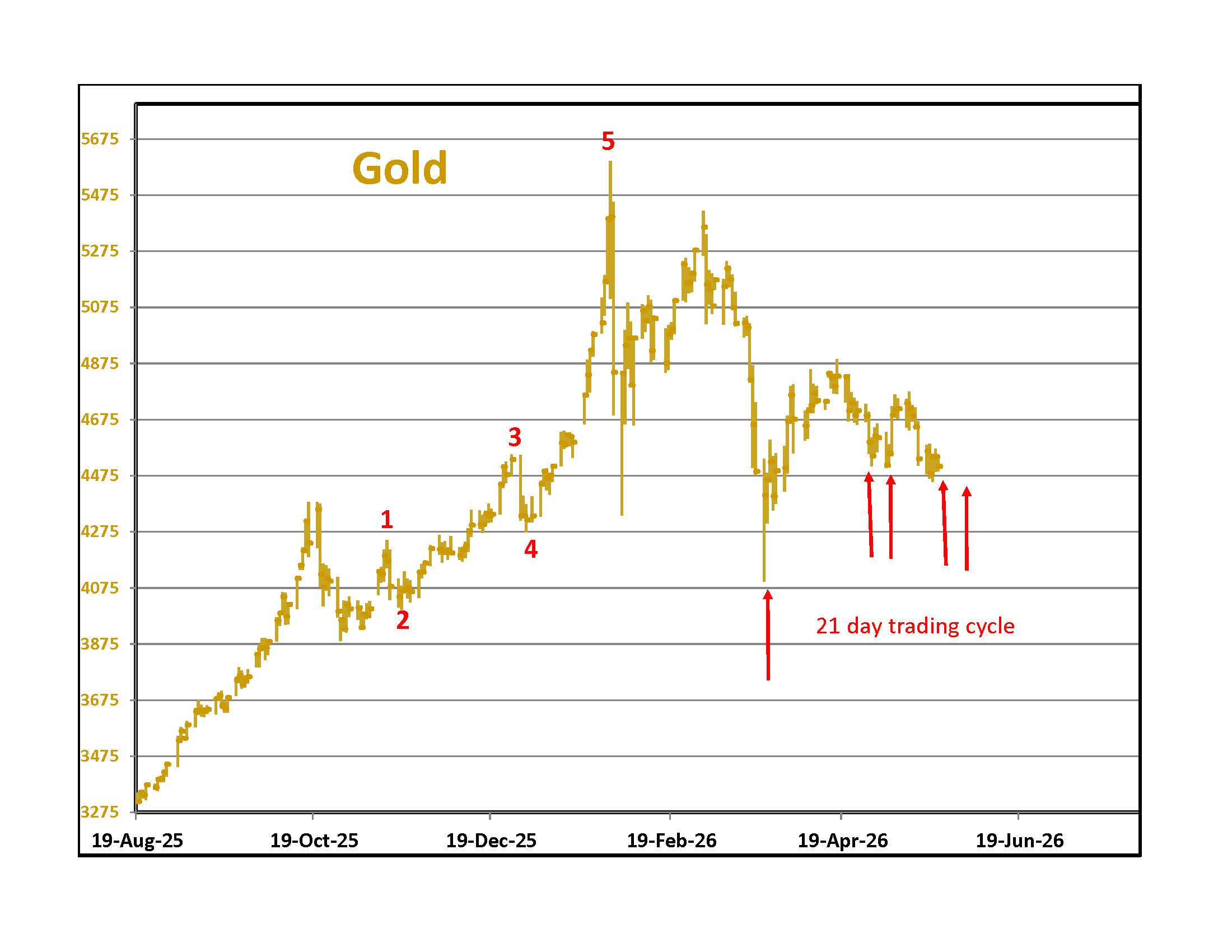
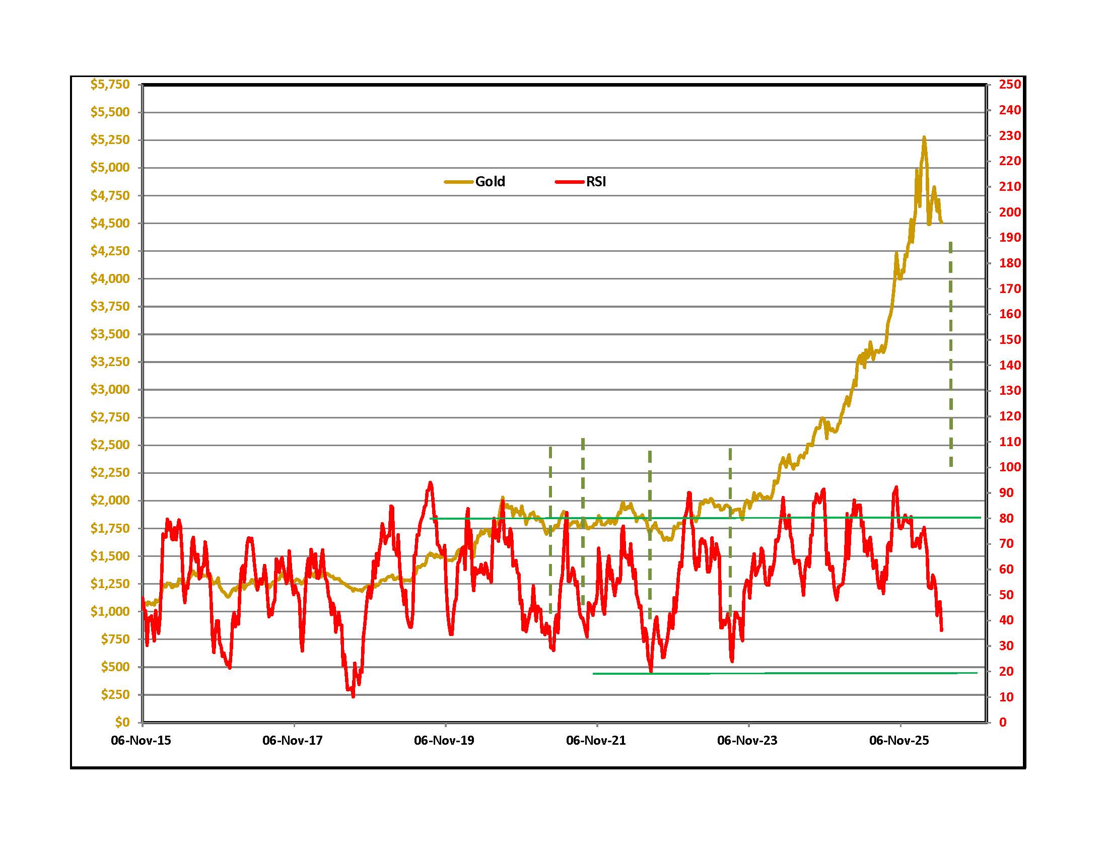
We had two lows around late April and early May. A Cyclesman.com. 21 trading day timing band is approaching for both lows. On the right is a graph of the weekly closing price of spot gold in NY with a simple RSI momentum oscillator in red. The best buys were at oscillator levels close to 0.20 and we are getting near. Over the last few years some of my favorite gold analysts said that gold goes up when you get a war. All of them say that gold protects you from inflation. We have war and inflation but gold is not doing much lately. Last week, after a down day, this was the headline of an on-line report - "Gold sells off on inflation fears." I thought it went up when inflation expectations rose! Lately, the fear has been that Central Banks in the Middle East and elsewhere will sell gold for Dollars to subsidize fuel costs or to pay obligations, including interest payments on debt. If we get a peace agreement you could see a relief rally.
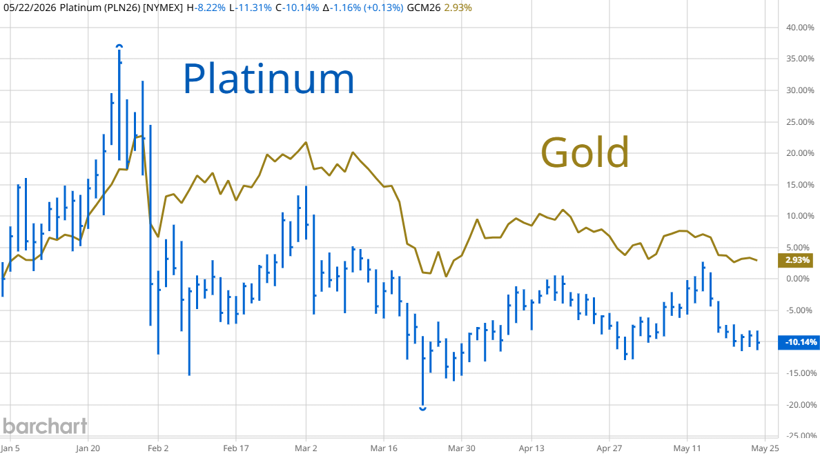
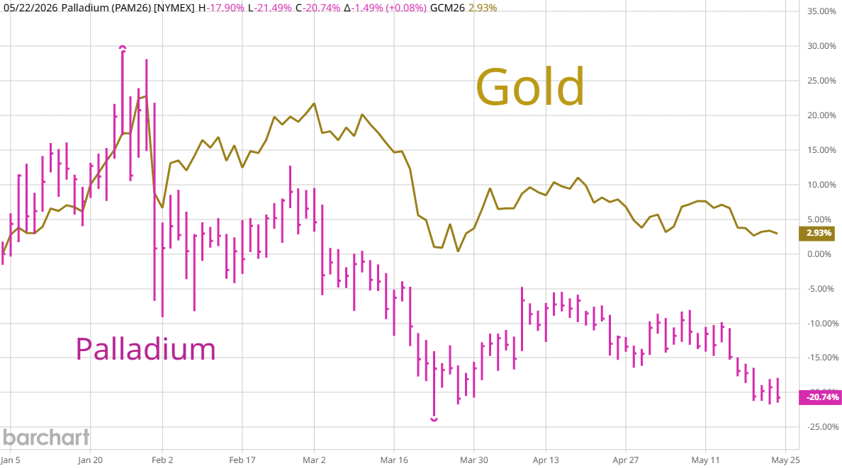
Platinum and Palladium are still hostages of gold. A 21 day trading cycle low in gold should be followed by both these metals.
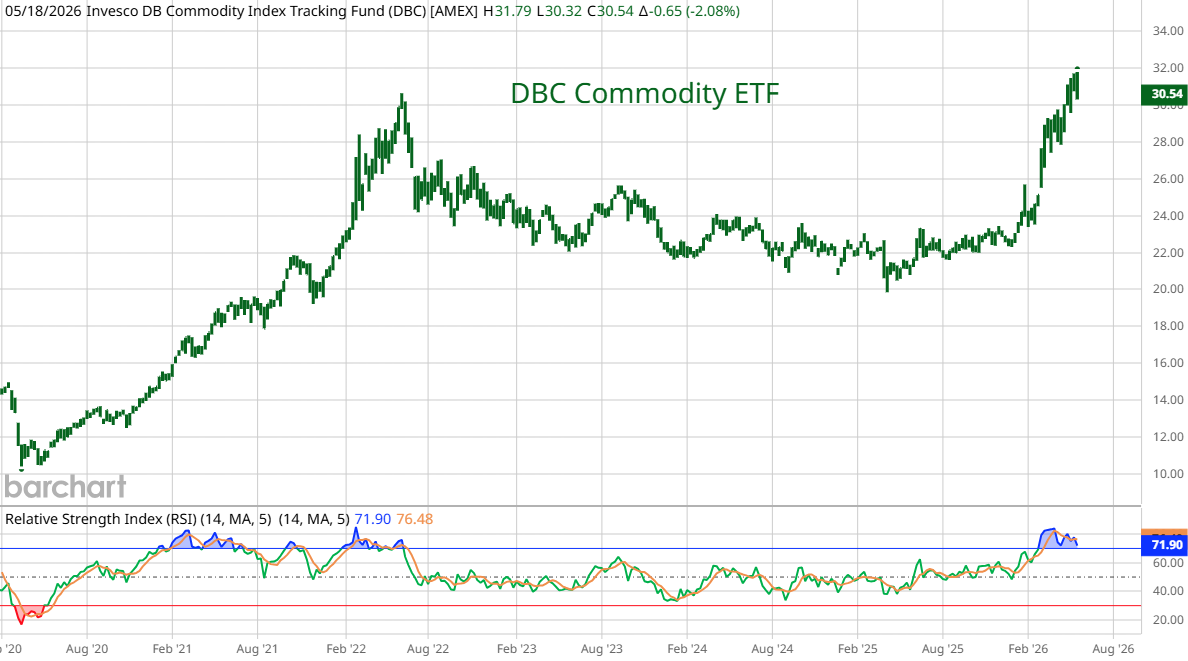

DBC is an ETF that tracks a basket of commodities similar to the Reuters CRB Index. It is weighted towards crops. The RSI momentum oscillator on this weekly bar chart is in over-bought territory. Many commodities are trading on Iran news. The war shut in production from one of the biggest aluminum producers in the world. A third of the world's fertilizer transits the Strait. If we get a reopening, there will be selling in all these commodities. Wheat requires a lot of fertilizer. Analysts say that farmers around the world are switching from wheat to other crops that don't need as much. The Chicago Wheat contract moves minute by minute with oil news so a peace deal will bring in sellers. Over time, weather and yields matter most. If farmers are planting less, supplies will be down next year.
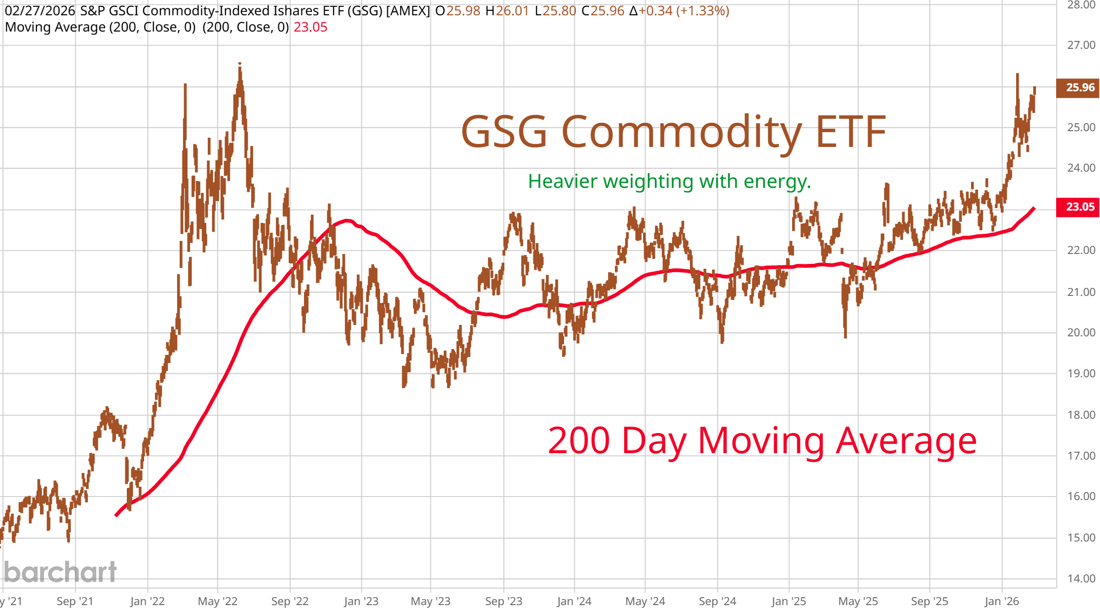
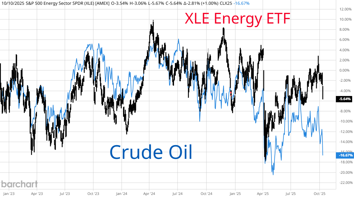
GSG is another Commodity ETF that is more heavily weighted with oil. Over the last few years it traced out a text book contracting triangle (pennant) that usually leads to a final spike then a reversal. DBC has a similar look. XLE, the big energy ETF also formed an a,b,c,d,e followed by a thrust higher. If you are looking for textbook perfection, you want to see the strongest part of the thrust followed by a pull back then a final up move but sometimes reality does not give us a textbook finish. It could be that we are at the reversal point now. Energy accounts for only 3.26% of the S&P 500 and 2.33% of the Dow Jones Industrials (Chevron) so a wipe out in this sector would have little impact on the averages and every other sector would benefit. However, money managers and individual investors are overweight energy so a relief selloff in oil, gasoline and diesel would spark a rapid rush to the exits in these shares with few buyers.
Best Guesses after news of a possible peace deal:
Stocks -
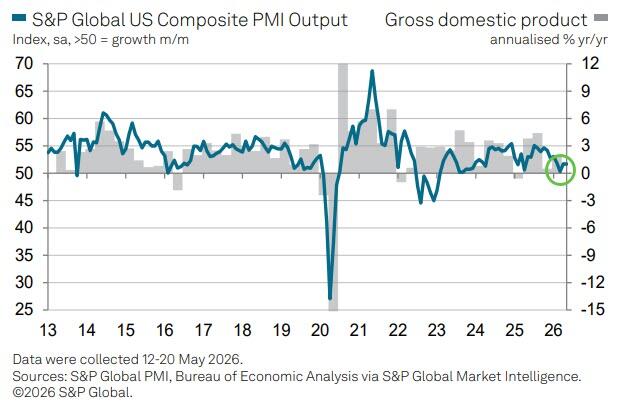
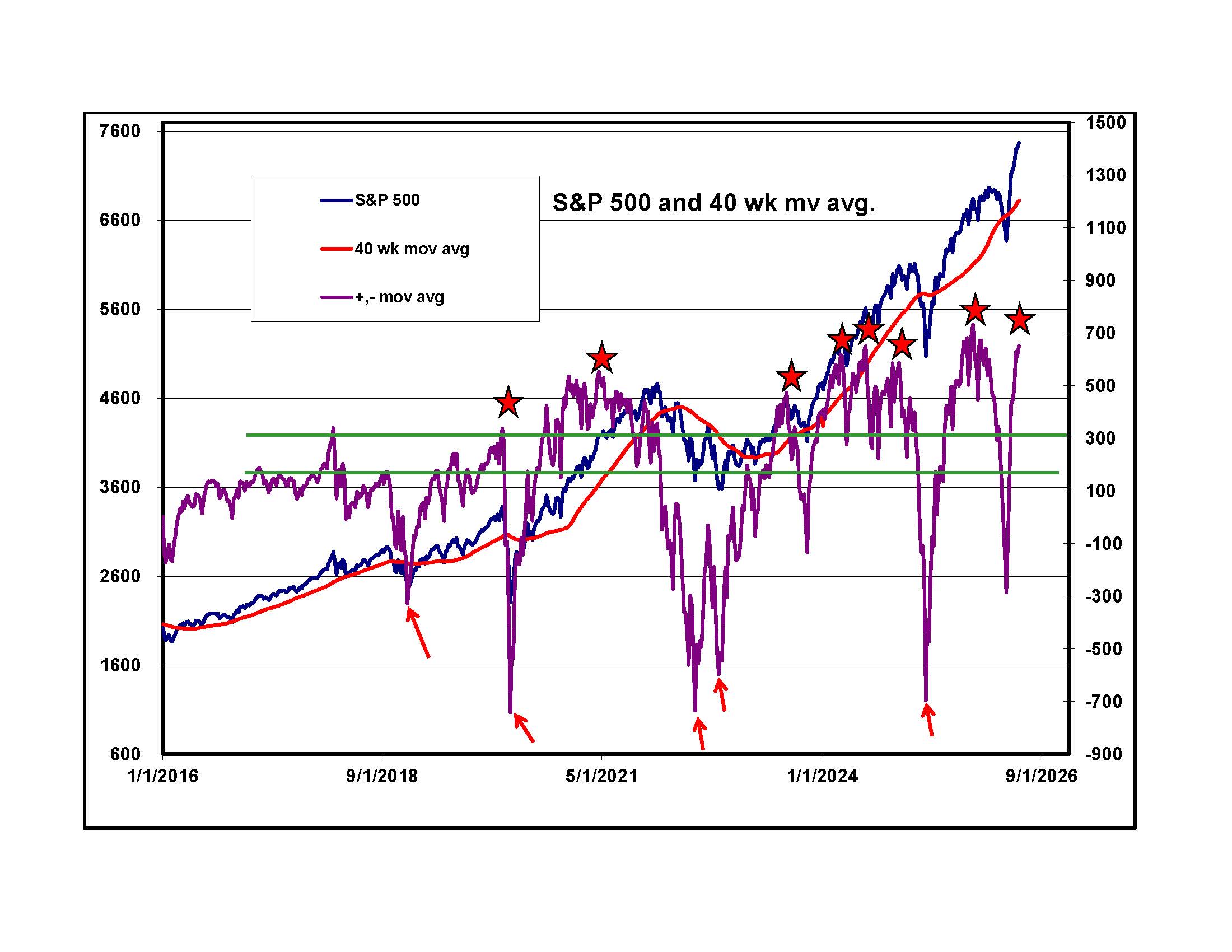
If we get a deal to open the Strait there should be a big relief rally on Tuesday morning. Above on the left is a graph from S&P Global that tracks Purchasing Managers' Survey data and economic growth in the U.S. Based on the latest survey they estimate 1% growth in the current quarter. That is a lot less than the stock market implies. On the right is a graph of the S&P 500, its 40 week moving average and the spread between them. Red stars mark previous momentum peaks. Some of them were close to market tops. Even if we get a relief rally on good news, my guess is that it marks a short term top. Watch semiconductors. Car rental companies have to buy newer cars then have enough business and charge enough to pay for the difference between the purchase price and the amount they can get when they sell the used car. For the hyper scalers buying chips and building data centers it is the same thing. There are some early data centers with Nvidia H 200 chips. It is likely that the companies that own these will never have enough revenue to cover the cost of construction and the circuits before they have to upgrade to newer chips. The question is: with the rapid changes in technology will these companies ever be able to make enough to cover the cost of existing technology before they have to upgrade to newer semiconductors.
also
We are in an era of turmoil. A deal with Iran is not the end of it. It is just a break in the action before another crisis hits.
Bonds - A deal with Iran will lower fears of inflation. 5% on a 30 year bond will look like a deal and we should get a rally. It will be the "e" on my graph of yields above.
Dollar - The Euro and Yen should rally if energy prices fall. The Dollar will do the opposite.
Gold and Silver - Look for silver and gold to join any short term relief rally
Commodities - Speculators will sell commodities on a peace deal but weather and acres planted are more important. I like grains on a pullback.
Oil - Let's see what happens over the next 48 hours. If there is an agreement to open the Strait, it will be all sellers and few buyers.
Best of luck,
DBE